Monthly Archives: January 2013

A GUIDE TO MAC TRANSITION EYESHADOWS

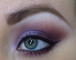
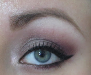
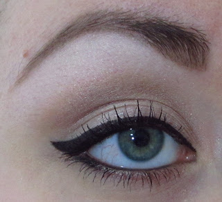
I’m obsessed with transition shades… is that weird? Maybe. Nonetheless, I’m writing this post to help explain the small differences between the MAC transition colors. Although the eyeshadows may seem very similar in the pan, each one will give you a totally different look when applied.

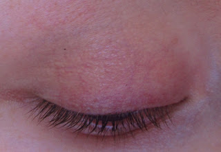
So what is a transition color? In the most simple of terms, it is the shade that helps blend your crease shade into your brow bone highlight. Typically it will be a matte shade 1-3 shades darker than your skin tone. The first step when applying eyeshadow is your transition! With a big fluffy brush you want to blend it from crease to right below your brow bone. My favorite brush to use is the 224 from MAC but there are plenty of big fluffy brushes in most brush lines.

I am only reviewing the shades that I personally own — which are all the transition colors for skin tones NC10-47/NW10-35. If you are unfamiliar with MAC foundation colors, that range is from very pale skin to medium/tan skin.

EDIT: If you are a woman of color or the eyeshadow you are looking for is not in this post, please see my Guide to MAC Matte Brown Eyeshadows. I wrote this post before aquiring the eyeshadows best used to transition darker skin.

Guide to MAC Matte Brown Eyeshadows (click HERE).

Guide to MAC Highlight Eyeshadows (click HERE)


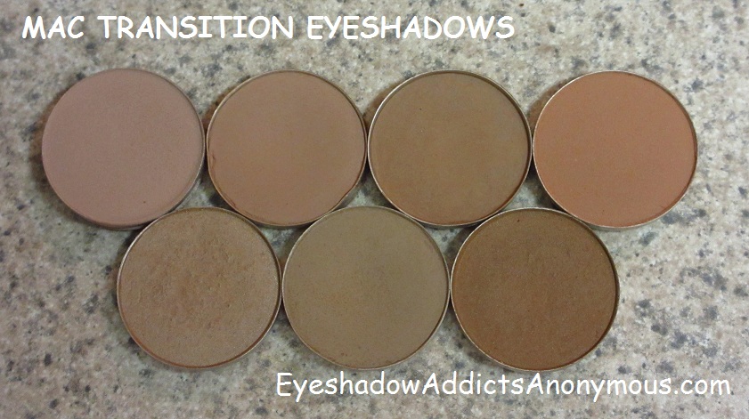
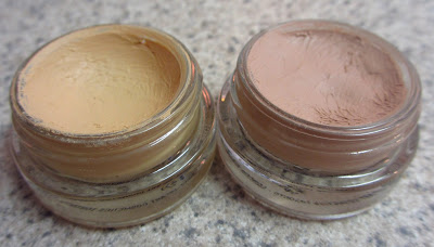
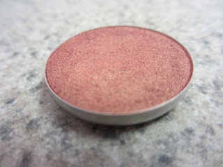
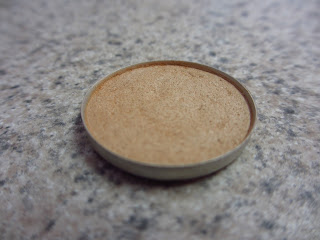
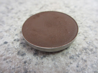
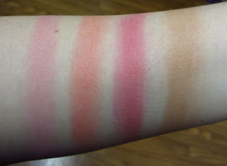
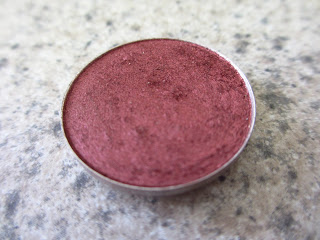
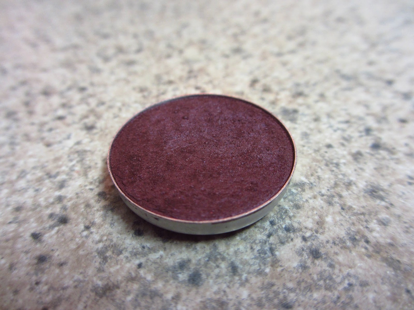
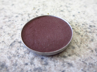
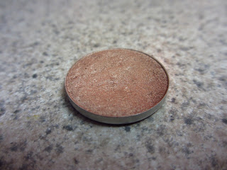
Top Left to Right: Malt, Kid, Wedge, Soft Brown
Bottom Left to Right: Era, Omega, Cork

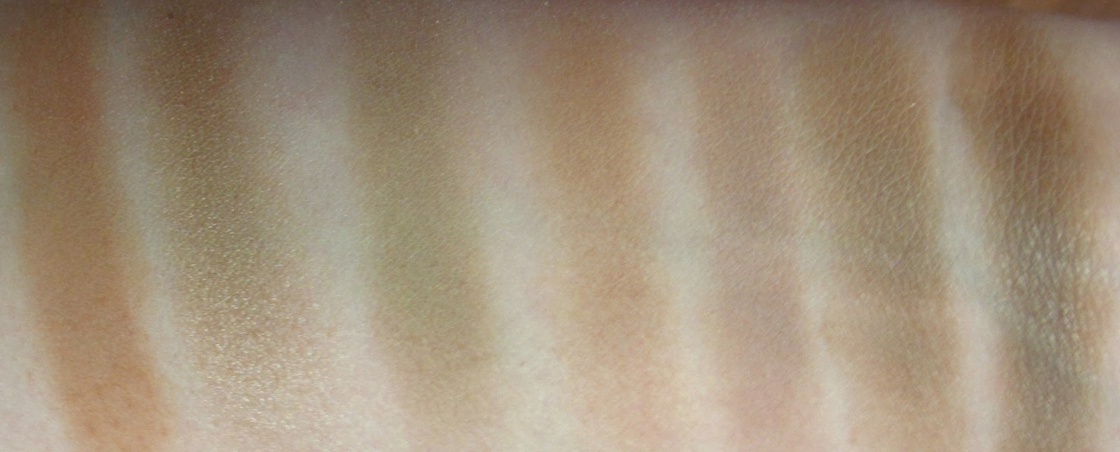
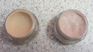
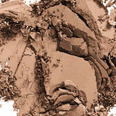
From left to right: Soft Brown, Era, Omega, Kid, Malt, Wedge, Cork

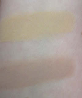
Please Note: Although they may look patchy in swatches, they do not appear that way when applied to the eye!
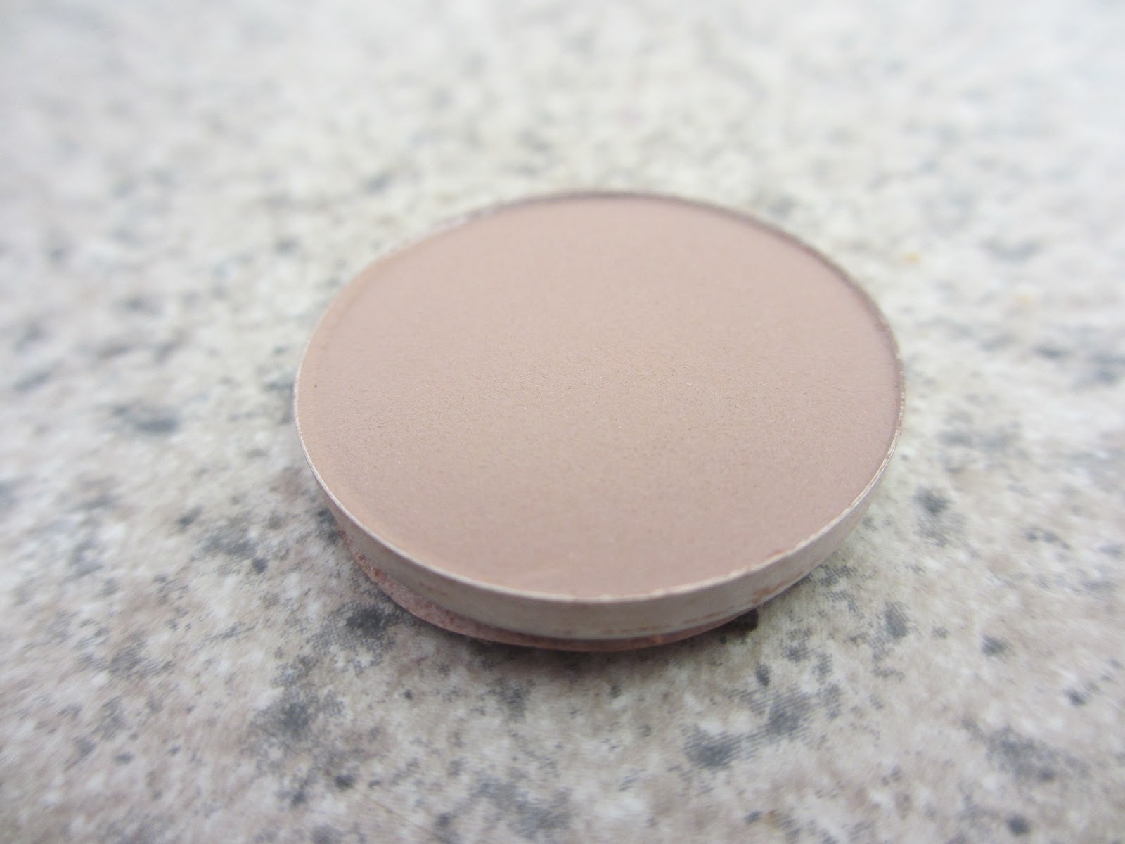
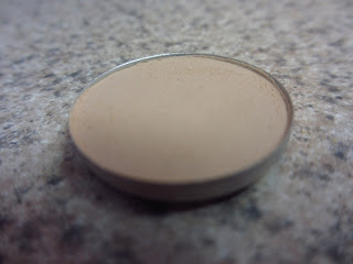
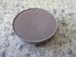
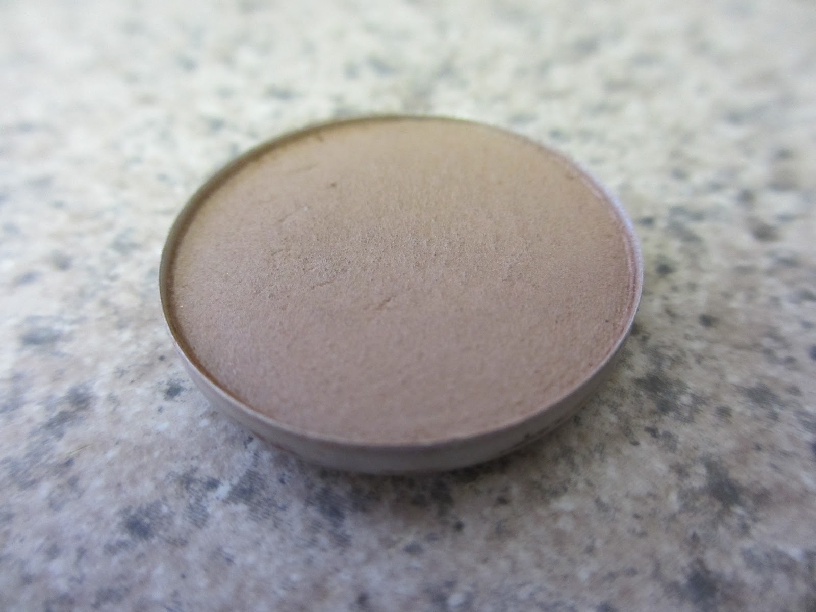
MALT (Matte)

Malt is a soft pinky beige and only works for VERY fair ladies. I have found the best way to apply this one is to use a more densely packed brush and really work it into the crease/above crease. This is by far the most subtle, but I have grown to like Malt quite a bit!
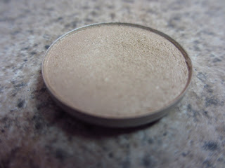
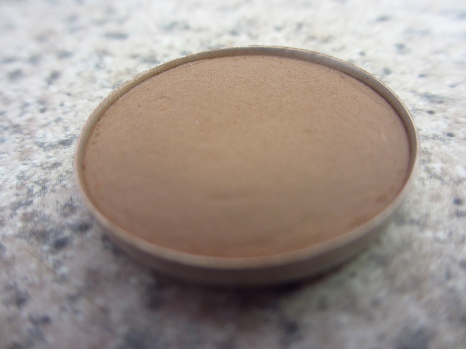
KID (Veluxe)

Kid is a warm peachy brown shade that is perfect for ladies NC5-NC25/NW10-NW20. Earlier this year MAC discontinued this one, and now it’s available again… Kid is a Veluxe so it has a very unique texture. The best way I can describe it is silky pigment that seems powderless.
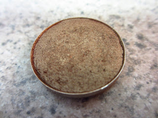
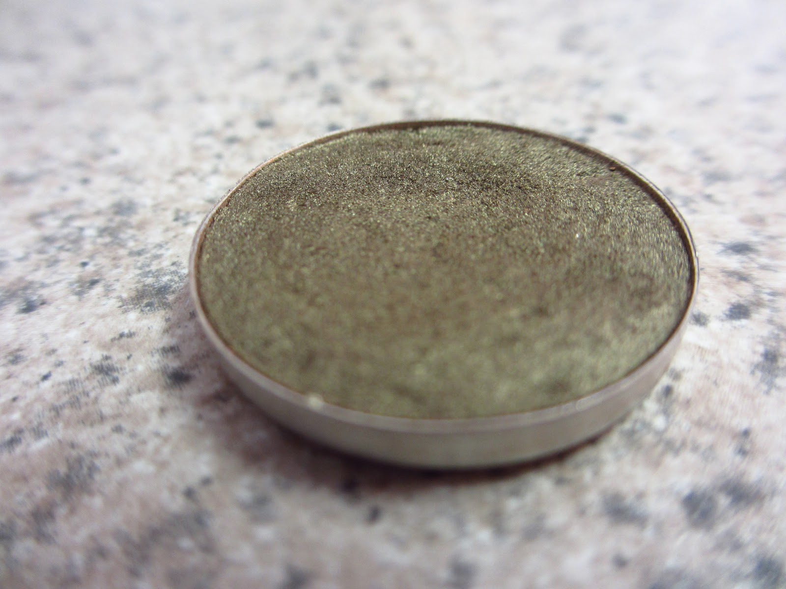
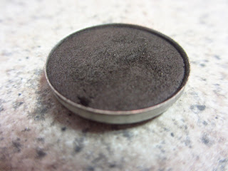
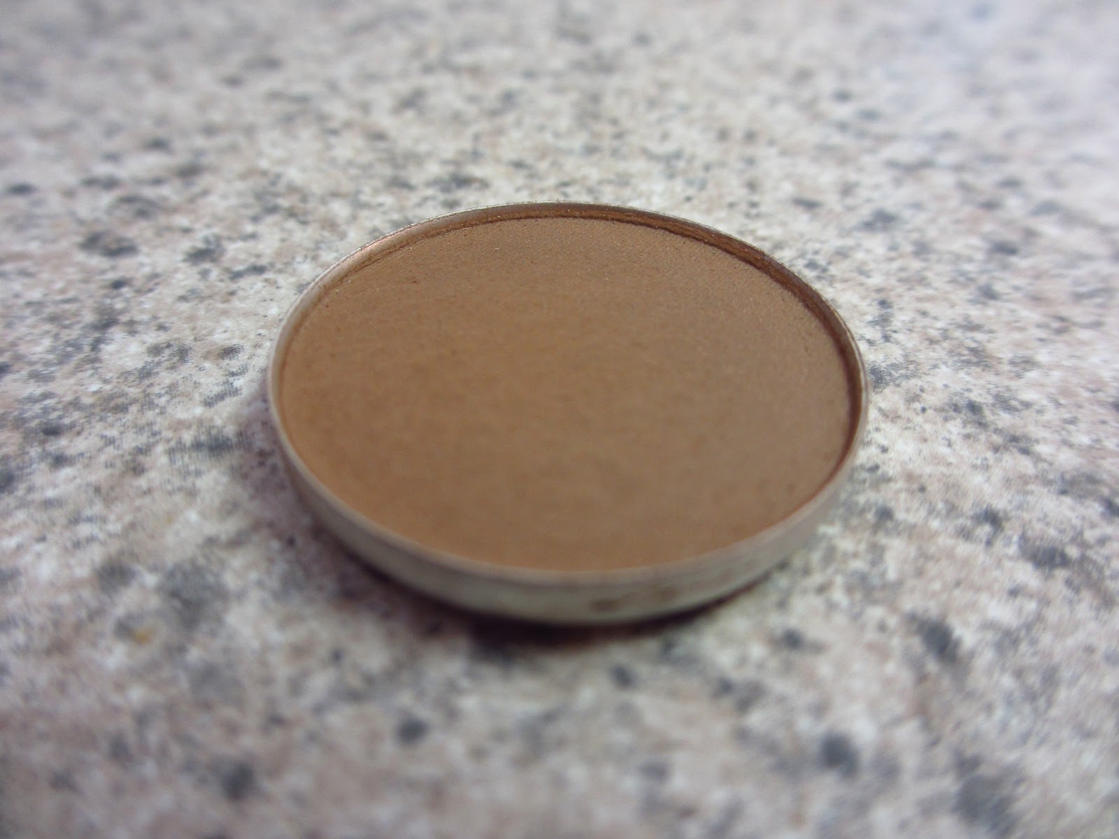
OMEGA (Matte)

Omega is a muted beige ashy taupe and a much cooler transition color than the others. I find that it can be a bit blah looking by itself, but I love to use it mixed with Kid or Wedge — to make the perfect neutral transition! Omega also looks amazing when used on eyebrows!
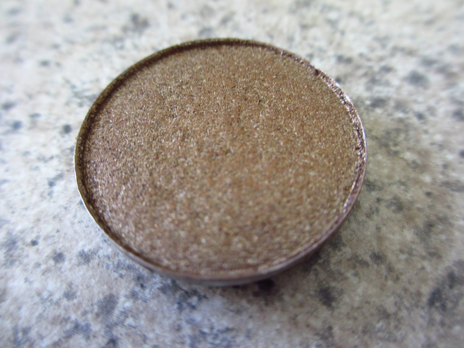
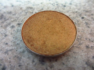
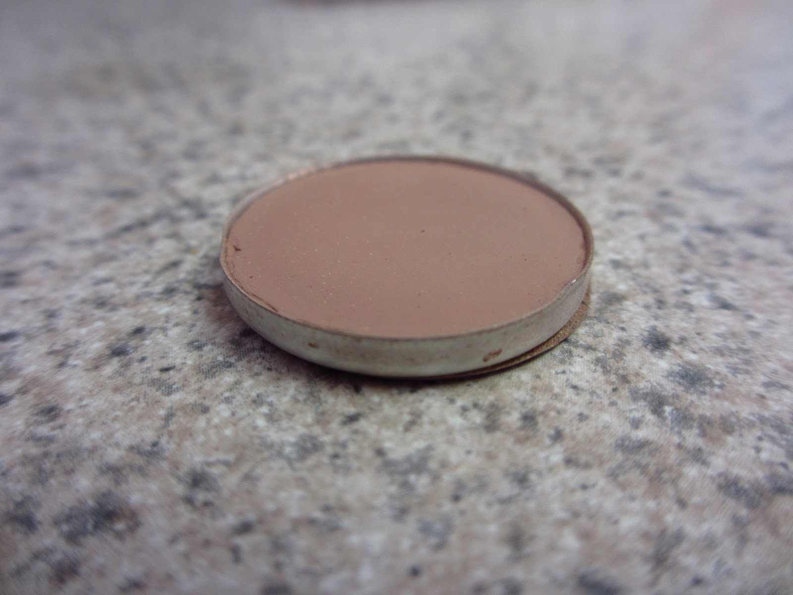
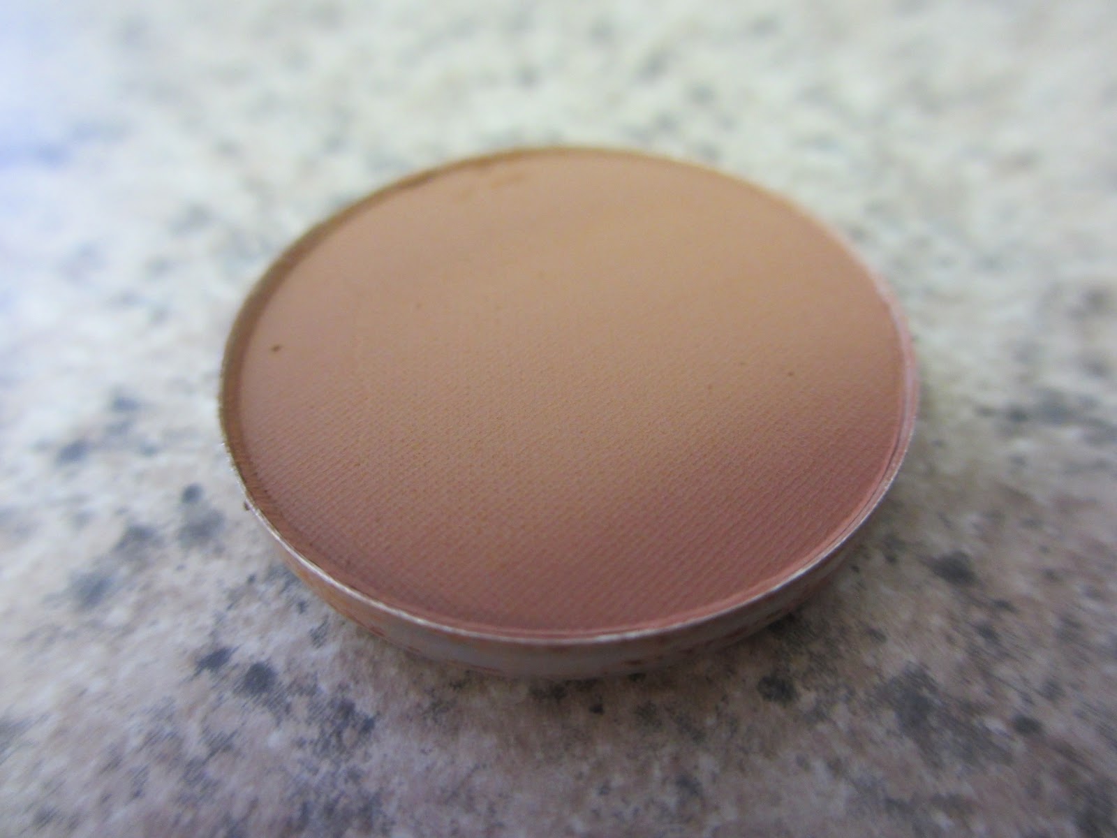
WEDGE (Matte)

Wedge is a soft warm beige taupe. Another great option, and one I would recommend this for ladies that kind Kid a bit too light or warm. I think this color looks lovely on light and medium skin, but may be just a bit too dark for fair skin gals (when used as a transition). I love to use Wedge as a crease color.
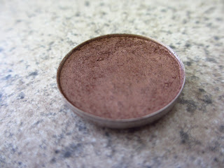
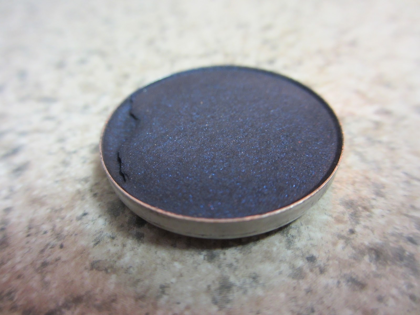
ERA (Satin)

Era is a soft golden beige with shimmer and a great transition for beginners because it has a little sparkle to it — which makes it a lot easier to blend. Don’t worry, it isn’t frosty!
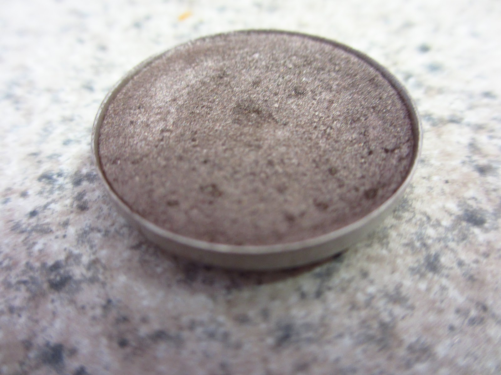
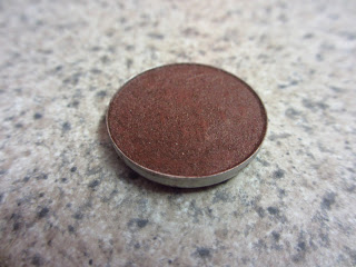
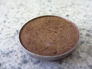
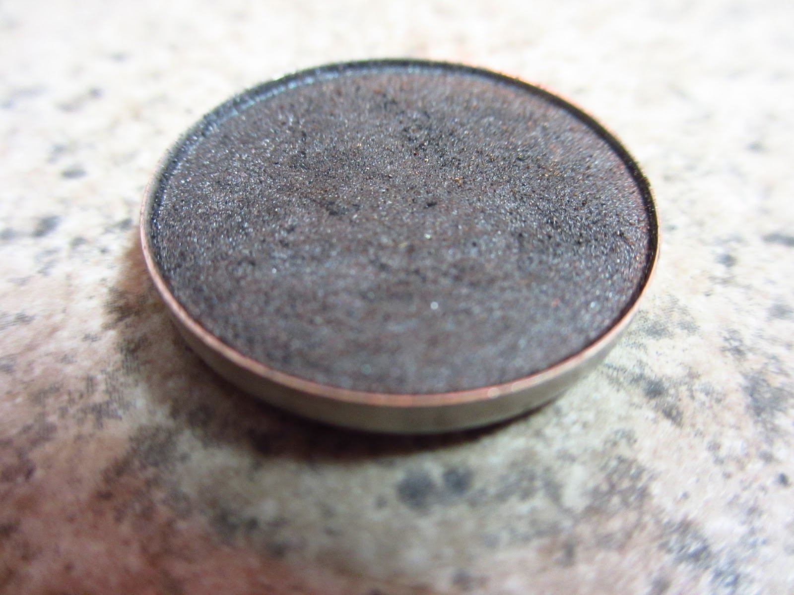
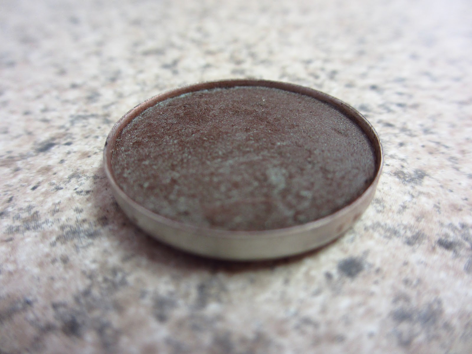
CORK (Satin)

Cork is a muted golden brown and although it is considered a Satin, Cork applies matte. I think it is a perfect transition for tan ladies with skintones around NC40/NW35 or above.  On my light skin it looks great in the crease!
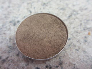
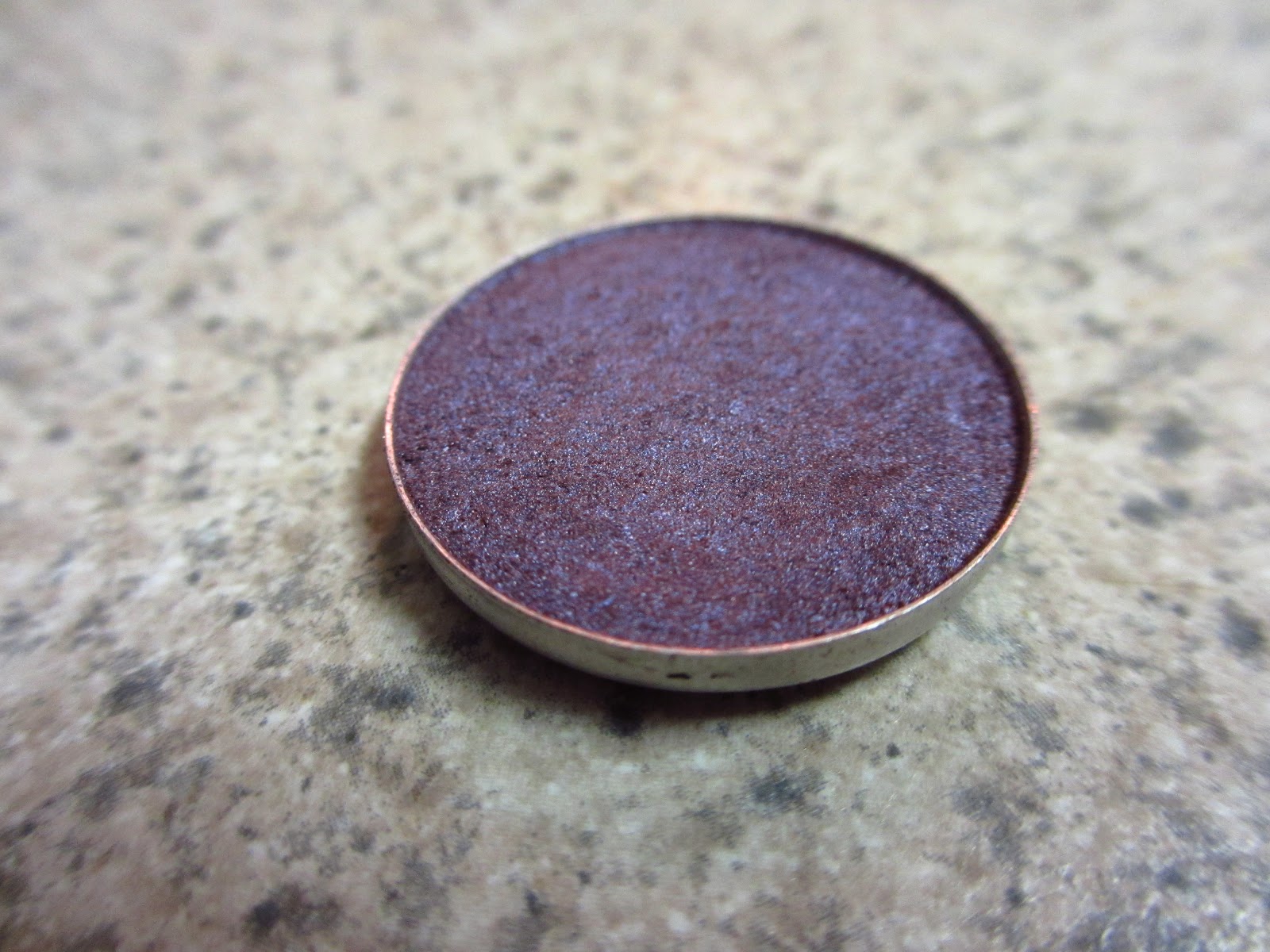
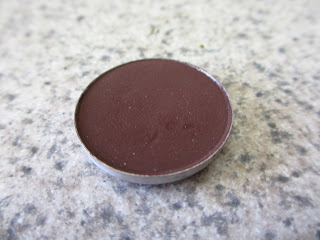
SOFT BROWN (Matte)

Soft Brown is a soft golden peachy brown that I think looks great on a lot of skin tones — from very fair to tan! Some lighter skinned gals may find that it pulls a little orange on them, but I think it’s a gorgeous color and has definitely become a favorite of mine.

The warmth in shades like Kid and Soft Brown can seem a bit scary, but that warmth is what will totally transform your look into something amazing!

I hope this was helpful!  Which transition colors do you use?

DON’T FORGET TO SUBSCRIBE!

-Sarah


Malt vs Kid, Kid vs Soft Brown, Wedge vs Cork, Kid vs Wedge, Soft Brown vs Cork


PAINTERLY VS SOFT OCHRE — MAC Paint Pots

Soft Ochre, Painterly

Soft Ochre and Painterly are matte eyeshadow bases that also act as a primer and eyelid concealer. In MAC terms Painterly is NW (cool toned) and Soft Ochre is NC (warm toned). The reason I am doing today’s comparison is because I think that there is a lot of confusion when it comes to these two!  Should I match it to my undertone? Should I use a particular one based on the eyeshadows I’m using? Hopefully I’ll answer those questions and any others you may have.

I originally bought Soft Ochre a long time ago because I am slightly yellow toned, and I thought it would be a better fit. After acquiring Painterly, I realized you can wear either one of them regardless of your undertone.

Roughly speaking, yellow neutralizes red and pink neutralizes blue. If you have a lot of redness on your eyelid and you would like to cover that and brighten up the eye, Soft Ochre may work better for you. On the other hand, if you have a lot of veins or bluish discoloration on your eyelid, Painterly may be the better choice.

Overall I much prefer Painterly for myself and most other skin tones — unless you have extremely yellow undertones, in which case Painterly looks very pink and strange. Soft Ochre has a drier formulation and can appear dry on the skin (you can see this in the eyelid pictures below). Painterly, on the other hand, applies much more smoothly.

Because they are both skin colored, they don’t change the look of the eyeshadow. Some say if you are doing a warm look to use Soft Ochre and for a cool look use Painterly. I don’t think they are different enough to justify purchasing both just for that purpose.

Paint Pots make eyeshadows pop and help them to appear true to the color in the pan. They also keep the eyeshadow from creasing on most people; If you have very oily eyelids, I would recommend Urban Decay Primer Potion over these. I also wouldn’t recommend Paint Pots for use on mature skin as it may tug.


EYELID COMPARISONS

NO MAKEUP — I had just removed my makeup so my eyelid is a little redder than usual, but I definitely have some discoloration!

SOFT OCHRE — Does a great job at covering up redness but doesn’t do much to cover my blue veins.

PAINTERLY — much less ashy looking and does a better job of covering up veins.

I hope that was helpful!  Do you use Painterly or Soft Ochre?

DON’T FORGET TO SUBSCRIBE!


TOP 10 MAC EYESHADOWS FOR MEDIUM SKIN

Oh beautiful tan ladies, how I envy thee… Medium skinned women have what many of us desire! Because most shades will look gorgeous on your skin tone, I have a easy job ahead of me!

BRULE (MATTE)

Perfect beige matte highlight! If you like something a bit lighter, you can go with Vanilla

SHROOM (SATIN)

Beige with shimmer — this is the most neutral highlighter that MAC has, and it goes with almost any look!

CORK (SATIN)

Muted golden brown — this is a great transition color for medium skin. If you wanted something warmer, you can go for Soft Brown.

WOODWINKED (VELUXE PEARL)

Beautiful multidimensional gold that almost appears wet when applied.

SATIN TAUPE (FROST)

Perfect on all skin types! I love this on the lid or as a crease color. It looks beautfiul when paired with Patina.

PATINA (FROST)

Patina appears different depending on the skin tone that it’s on. It looks like a complex pewter on medium skin. LOVE!

SUMPTUOUS OLIVE (VELUXE PEARL)

One of my favorite shadows for any skin tone or eye color!

TWINKS (VELUXE PEARL)

Plummy brown that looks gorgeous on medium skin… you can use this on the lid or in the crease!

TEMPTING (LUSTER)

Perfect neutral brown with shimmer and glitter… one of the only Luster eyeshadows that I recommend!

SMUT (VELVET)

One of the most difficult eyeshadows to describe. It is a warm grey, brown, muted black with red shimmer. It is amazing in the outer v!

Thanks for reading, LOVE YA!

DON’T FORGET TO SUBSCRIBE!


TOP 10 MAC EYESHADOWS FOR DARK SKIN

There are so many MAC shadows that I think are gorgeous but they just don’t suit my skin tone. So, I’m going to live vicariously through all you dark skinned beauties out there!

The term dark skin is very broad and I know that there are lighter skinned woc and those with the deepest shades of ebony, so I tried to pick the most flattering colors to varying shades of dark skin.

Please comment below and add any suggestions you may have!

SABLE (FROST)

Beautiful plummy brown with shimmer! It is such a gorgeous color on dark skin!

WOODWINKED (VELUXE PEARL)

One of the most stunning neutrals on dark skin… it looks like a multidimensional gold.

SATIN TAUPE (FROST)

No matter your skin tone, I recommend Satin Taupe to EVERYONE. It’s amazing!

BRONZE (FROST)

True bronze color that looks beautiful on everyone!

AMBER LIGHTS (VELUXE PEARL)

True amber — a beautiful lid or crease color!

EXPENSIVE PINK (VELUXE PEARL)

Pink with gold duochrome — absolutely STUNNING on dark skin!

RICEPAPER (FROST)

Peachy gold with shimmer — gorgeous highlight!

HANDWRITTEN (MATTE2)

Rich chocolate brown — Amazing in the crease and it has the most buttery texture ever!


SADDLE (MATTE)
Golden Orange Brown — Beautiful as a transition shade!

ARENA (SATIN)
Soft Gold-Peach with Pearl — Beautiful on the lid or as a highlight!


TARTE BLUSH COLLECTION AND REVIEWS

Tarte Amazonian Clay 12-Hour Blushes have become extremely popular, as I’m sure you know! With any product that is hyped to heaven there is usually some truth in all the exaggeration. These blushes are definitely a great product, and worth looking into! A lot of us makeup addicts went a little crazy and wanted to buy them ALL!

I prefer matte blushes because I think they are much more versatile, and a good majority of Tarte blushes have shimmer. The four I have are the most useful for my collection, and I will only be reviewing the ones I own.

Tarte claims that amazonian clay has numerous benefits for the skin such as balancing skin moisture and oil control — making it suitable for all skin types. I’m not sure if all that is completely true, but I do know that they do not get patchy or greasy like some blushes, and the staying power is outstanding!

HERE is a link to my review of Exposed — which I purchased after writing this post.

DOLLFACE (Matte)

I must admit I had to edit this page to reflect my change in opinion. I absolutely love this baby pink blush, especially when I have a strong contour. Dollface is in the same color family as MAC Well Dressed but definitely not a dupe. Click HERE for swatch comparisons of the two.

BLISSFUL (Matte)

Tarte’s online description is a bit off… I would definitely consider this a warm pink rather than a peach. Blissful has a drier texture, so you have to dig a little more with your brush in the pan. Texture aside, it looks gorgeous on the skin and is probably my favorite!

FLUSH (Matte)

Flush is a berry-purple. This is the most pigmented blush I have ever used in my life! I love the way this looks on my fair skin — it’s a perfect “just in from the cold” flush. I think it would look amazing on any skin tone, especially dark skin! Because it is so pigmented, I like to use a fan brush to apply.


BUFF

This is a gorgeous warm nude with glitter. I personally hate the glitter but not to worry — when you tap your brush before applying, 95% of the glitter falls off and never makes it to your face. There is no shimmer so it ends up applying nearly matte. Fair skin tones can even use this as a bronzer.

CLICK TO ENLARGE
(Right to left: Dollface, Blissful, Flush, Buff)


I did lighter swatches and blended them out to get a more realistic portrayal of what the blushes would look like on the cheek. Although they appear a little patchy in the picture, I can assure you that they won’t apply like that on your cheeks. My favorite brush to use is the MAC 168 — goat hair large angled contour brush. I would try to avoid synthetic hair brushes when using such pigmented blushes because they tend to grab and deposit more color — easy to look like a clown with these blushes 🙂
 
 
Overall I really like them and I can’t wait to pick up my next and final Tarte Blush — TIPSY! I will let ya’ll know how I like it!
 
 
Do you own any Tarte Blushes? How do you like them?


PUTTING A LOOK TOGETHER — Coordinating Eyes, Lips, and Cheeks


This post has been requested by a couple of readers, so I hope this answers some of your questions!! My goal was to explain how to coordinate different colors and put looks together without being too matchy, matchy. The most important thing to remember is that there are no rules in makeup, only guidelines. So if you decide to put a strong lip with a smokey eye and it makes you feel sexy, then go for it!

USE SHADES THAT ARE FLATTERING TO YOUR UNDERTONE — I did an entire post to fully explain undertones (click here) but in simple terms you have either warm or cool undertones… If your skin is cool you have more pink undertones, and if you’re warm you have more yellow. In general cool skintones look best with jewel tones like navy, emerald green, and purples on their eyes, and warm skintones look great in bronzy colors and earth tones. You do not always have to follow this, but it helps to understand undertones when you are trying to decide what looks good on you.

KEEP YOUR LIPS AND CHEEKS IN THE SAME COLOR FAMILY —  You do not want your lips and cheeks competing or clashing with one another! Typically speaking, there are four main color families for blush: pinks, peaches, neutrals and berry tones. The lips and cheeks should be from the same family but not the same color. For example, If you are wearing a bright pink lip, go with a soft, light pink cheek. There are definitely exceptions to every rule — red lips being one of them!


PICK ONE FEATURE TO ACCENTUATE — Above all else, this is the most important point I will make. Whether you are doing a daytime look, or  something more dramatic, you should pick one feature on your face that you want to focus on. Whether it be a bright lip, a flushed cheek, or a deep smokey eye — pick ONE! I typically focus on my eyes because they are my favorite facial feature, but it’s an individual thing. You don’t have to have a strong eye or lip, just don’t have both!

  • Bright/Strong Lip —  make your eyes and cheeks the best supporting actors they can be. With a strong lip, I like to keep the eye completely neutral, and use a blush in the same color family as the lip. If you are doing a red lip, a little bronzer in the place of blush is usually best.

  • Smokey/Bright Eye– Let those beautiful peepers get the attention they deserve! With a dark smokey eye, I typically wear a neutral blush and nude-pink lips. If wearing color on the eye, you want to choose colors on your cheeks and lips that subtly enhance the eyes.

Below are a couple different eye looks that are from previous posts, and next to them I describe what I think would look nice with similar looks. Rather than me blabbing for pages, here are some visuals:

What would you wear with these looks?

Bright Purple

This bright purple eye would looks best with a nude lip and a neutral blush or bronzer.

Avoid pink cheeks or lips because it can look a little like Malibu barbie!

Neutral Bronzy Look

I like to wear a warm pink blush and lips with this one, but you could wear just about anything with it!

(If it were a warmer eye with oranges and golds I would avoid pinks)

Daytime Purple Look

Because this is more of a daytime purple look, I would wear a neutral cheek and a nude-pink lip.

Winged Liner

This would be the perfect eye to wear a bright red lip or a statement cheek… this is my version of a completely neutral eye!

Or you can tone it down and make the lips and cheeks pretty in pink!

You can really do no wrong… just make sure that the blush and lips are in the same color family.

Green Smokey Eye

My favorite look to wear! Green can be a little tricky because it looks odd with most colors on the lip so I usually go with a nude lip. For the cheeks I like to use either a neutral or slightly peach blush.

With greens, AVOID PINK at all costs!


I hope that was helpful! It takes practice putting looks together to see what works and what doesn’t. I will be doing my undertone post soon and hopefully that will answer any questions that you may have! If you have questions or comments please leave one below!
 
 
AND DON’T FORGET TO SUBSCRIBE!!! 🙂


Growing Out Your Eyebrows — How to Remain Sane!

I decided to grow out my eyebrows on December 2, 2012. I remember the date because I had just flown into Austin to visit my best friend of about 10 years, when she told me about growing out hers — which looked fabulous, by the way. A wave of inspiration hit me! “I can do this!” I told myself.

It is now almost 2 months later, and I am starting to get a little restless. My goal was to leave my brows alone for 6 whole months! After doing research online, 6 months seemed to be the gold standard. Now that I have endured this torture, I have vowed never to tweeze my eyebrows again!

I have been over plucking my already sparse eyebrows for the last 10 years… I always justified my habit with thoughts like: “But I’m so good at filling them in…”, “I want a sky high arch”, “Oh, they’ll grow back…” Well ladies, those days are past me. I have turned a new leaf, and I am going to embrace every random, tiny, little hair that is anywhere near my eyebrow. Well, maybe that’s a bit much, but you get the picture!

Along the way, I have come up with a couple little tricks that have helped me stay sane while growing out my brows:

    Avoid wearing makeup when it’s not necessary — I’ve come to realize the only time my unkept eyebrows seem to really bother me is when I’m doing my makeup. If I’m just hanging around the house or running up to the store I don’t put on any. This may not be practical for everyone, but it works for me.

    Fill them in
     — Fill in the area right underneath your brow. By filling this area in, it will appear that you have a clean bottom line — by covering the new growth with pencil or powder, the brows appear more neat. Be careful not to go overboard, or you may start to resemble Boy George.

    Avoid using a brow highlight — This may seem obvious, but when doing your makeup try to avoid anything shiny or glittery in that area. This will only, well, HIGHLIGHT the problem.

    Use a concealer — Using a concealer to cover regrowth works well if you don’t have extremely coarse hair.

    Use brow gel — This can help keep the scragglies in line.

    Hide your tweezers — Unless you have ridiculous willpower, I recommend putting these away for a couple months. It is easier to get through the process without having to look at your old accomplice.

    Brush your brows — I’m not sure if this really helps, but I have read that if you brush your eyebrows with a spoolie, it stimulates blood flow and hair growth. Who knows if it does anything, but it can’t hurt!

    Keep your eye on the prize — I know it’s hard, but YOU CAN DO THIS.

      Have you ever grown out your brows?

      Thanks for reading, and stay strong ladies!

      DON’T FORGET TO SUBSCRIBE!


      TOP 10 MAC EYESHADOWS FOR BROWN EYES

      My brown eyed gals!!! This is part three of my mini-series: Top 10 MAC Eyeshadows for Your Eye Color.  Brown eyes look fabulous with just about ANY color! You can pull off bright colors, neutrals, and anything in between! The majority of the eyeshadows in the post are pretty bright. If you are looking for great everyday neutrals please click the link below.

      Click HERE for my Top 15 Neutral MAC Eyeshadows

      Click HERE for my Top 10 MAC Eyeshadows for Fair/Light skin.
      Click HERE for my Top 10 MAC Eyeshadows for Medium/Tan Skin
      Click HERE for my Top 10 MAC Eyeshadows for Dark Skin

      Here are my recommendations for BROWN EYES:

      KNIGHT DIVINE (VELUXE PEARL)

      Knight Divine is an asphalt black with silver pearl, but applies like a blackened grey with shimmer. It is gorgeous with brown eyes — it makes them glow! Kind of reminds me of the way a wolf’s eyes glow at night.

      TEMPTING (LUSTER)

      MAC calls Tempting a “sinfully rich cocoa” and I guess I agree with that vague description. This is one of the very few Luster finish eyeshadows from MAC that I really like. Tempting looks gorgeous on brown eyes! If you aren’t a fan of glitter, I would avoid this shadow.


      WOODWINKED (VELUXE PEARL)

      Beautiful gold color that looks great by itself on the lid, or smudged along the lower lash line. It can appear a little orange on fair skin, so keep that in mind if it applies to you. Although they look similar in the pan, Tempting and Woodwinked look nothing alike on the eye.

      SUMPTUOUS OLIVE (VELUXE PEARL)

      I love this color sooooo much. I recommend this one to everyone, especially ladies with brown eyes. It is a bronzy olive green on the lid.

      HUMID (FROST)

      If you could only have one green eyeshadow from any makeup brand, this should be it!!! Put Humid on the top of your makeup wishlist! I would say that it is a mix between a hunter green and a forest green with shimmer.

      CONTRAST (VELVET)

      Navy eyeshadows look GREAT on brown eyes; Contrast is a purpley navy with blue shimmer. I love this color in the crease or on the lid… you can also smudge it along your lower lash line.

      SATELLITE DREAMS (VELUXE PEARL)

      Beautiful midtone purple with bluish purple shimmer. I think this shadow looks good on cool and warm skin tones alike, making it a universally gorgeous shade! This too is a pretty bright eyeshadow, so bear that in mind!

      SATIN TAUPE (FROST)

      Satin Taupe looks gorgeous on EVERYONE, and brown eyes are no exception. It is a metallic taupe with a slight purple undertone. There is a reason ST is the most talked about eyeshadow on the internet…

      CRANBERRY (FROST)

      Cranberry is a true cranberry color with shimmer. It has superb texture, pigmentation, and blendability, and makes brown eyes pop! It can be a little intimidating at first, but definitely worth checking out.

      NOCTURNELLE (FROST)

      Nocturnelle is warm darker purple with shimmer. I really love the way it pairs with both Satellite Dreams and Satin Taupe.

      THANKS FOR READING! DON’T FORGET TO SUBSCRIBE!

      -Sarah


      TOP 10 MAC EYESHADOWS FOR BLUE EYES

      Today’s post will have a lot of warm, bronzy, golden shadows because they really make BLUE EYES POP!

      Click HERE for my Top 15 Neutral MAC Eyeshadows

      Click HERE for my Top 10 MAC Eyeshadows for Fair/Light skin.
      Click HERE for my Top 10 MAC Eyeshadows for Medium/Tan Skin
      Click HERE for my Top 10 MAC Eyeshadows for Dark Skin

      WOODWINKED (VELUXE PEARL)

      Woodwinked is a very warm antiqued gold. The texture is smooth and it has a VERY metallic finish. It can show up a little orangey on fair skin, but the orange hue brings out blue eyes — so don’t be scared!

      AMBER LIGHTS (FROST)

      Amber lights is a true amber color with shimmer, and is absolutely stunning on blue eyes!

      BRONZE (FROST)

      Bronze is absolutely perfect! It is a true bronze color that does not lean too red or orange. I’m obsessed with this color on green and blue eyes. Although it is a frost, the finish isn’t overly metallic, which makes me love it even more!

      CRANBERRY (FROST)

      Cranberry is a, well, true cranberry color with shimmer… if you find that you can pull off red based colors, then this is a MUST HAVE!

      SKETCH (SATIN)

      Sketch is a gorgeous wine/burgundy color! It looks great in the crease and outer v… The finish is a Satin and it applies nearly matte. It does take a little more work to blend, but totally worth it in the end! (I didn’t mean for that to rhyme)

      SABLE (FROST)

      Sable is a beautiful plummy, bronzey, brown with shimmer — it is not overly frosty. Looks great on the lid by itself or with Cranberry!

      SATIN TAUPE (FROST)

      I’ve said it before, but I’ll say it again… EVERYONE NEEDS THIS EYESHADOW! Satin Taupe is a gorgeous purpley taupe that looks great on just about anyone. Obsessed.

      ALL THAT GLITTERS (VELUXE PEARL)

      ATG is a beautiful pinky/peachy champagne. The texture is to die for! I love wearing it on the lid, or as a wash!

      CONTRAST (VELVET)

      Contrast is a dark plummy navy that looks AWESOME on blue eyes! I will say that it is a little more difficult to work with than some other MAC shadows… Contrast usually works best as liner and it the crease. On the lid it can appear a little patchy unless you really pack it on.

      COPPERPLATE (MATTE²)

      Copperplate is a grey Matte², with the the most buttery smooth texture, and amazing pigmentation. I love the way soft greys bring out blue eyes!

      HOPE THAT WAS HELPFUL!


      TOP 10 MAC EYESHADOWS FOR GREEN EYES

      Click HERE for my Top 15 Neutral MAC Eyeshadows
       

      Click HERE for my Top 10 MAC Eyeshadows for Fair/Light skin.
      Click HERE for my Top 10 MAC Eyeshadows for Medium/Tan Skin
      Click HERE for my Top 10 MAC Eyeshadows for Dark Skin


      SATIN TAUPE (FROST)

      Satin Taupe is absolutely gorgeous and because it has purple undertones, it really makes green eyes stand out!

      SATELLITE DREAMS (VELUXE PEARL)

      Satellite Dreams is a midtone purple with bluish purple shimmer. This shadow looks stunning on green eyes! I love to wear it with my next recommendation…

      
      NOCTURNELLE (FROST)

      Nocturnelle is a “pinked up chrome purple” according to MAC. I would call it a deep red based purple. This is a must have and pairs beautifully with Satin Taupe and Satellite Dreams.

      BRONZE (FROST)

      Like I’ve said before, MAC’s Bronze is the most perfect true bronze shade EVER made. The warmth in this color makes it extremely flattering on green eyes.

      SUMPTUOUS OLIVE (VELUXE PEARL)

      I absolutely LOVE this color for green eyes! When applied it looks like a bronzy olive green, and it is a fun shadow to mix in with neutral looks.

      HUMID (FROST)

      No surprise here… I recommend Humid to everyone, but especially if you have green eyes. This is one of the best MAC eyeshadows hands down. Some say people with green eyes shouldn’t wear green shadows… Rules are made to be broken, and Humid is the perfect example!

      CLUB (SATIN)

      For a full review on Club, click here
      The reddish brown base in club works wonders on green eyes, and don’t even get me started on the teal duochrome!!

      SABLE (FROST)

      Sable is a bronzy, plummy, brown. It is gorgeous all over the lid, and can be worn by itself.

      EMBARK (MATTE)

      Embark is a matte red based brown that looks great with green eyes!

      SKETCH (SATIN)

      Sketch is a very popular wine/burgundy color that is amazing as a crease color!

      LOVE YA!!   DON’T FORGET TO SUBSCRIBE!!

      -Sarah